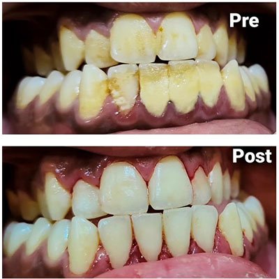
Scaling Treatment

Advanced Dental Treatment
Modern Technology
Providing The Best Quality Treatment
Worldwide Services
We Have Highly Qualified Expert Doctor
Our Qualified Team
Our approach to content scaling revolves around the following key principles:
Responsive Design: We employ responsive design techniques to create websites that automatically adjust and adapt to the user’s device, whether it’s a desktop, tablet, or smartphone. This ensures that our content remains accessible and visually appealing across all platforms.
Flexible Layouts: Our layouts are designed to be fluid and flexible, allowing content to reflow and rearrange based on the screen size. This flexibility ensures that users can easily navigate our website regardless of the device they are using.
Optimized Media: We optimize images, videos, and other media elements to ensure fast loading times and optimal performance on all devices. This includes techniques such as using responsive images and lazy loading to deliver an efficient and smooth browsing experience.
Scalable Typography: Typography plays a crucial role in readability, especially on smaller screens. We use scalable fonts and adjust font sizes dynamically to ensure that text remains legible and easy to read across different devices.
Touch-Friendly Interactions: For touchscreen devices, we implement touch-friendly navigation and interaction elements to provide a seamless browsing experience. This includes larger buttons, swipe gestures, and optimized forms for easier input.
